Thursday, November 29, 2012

Western Scene Update

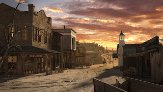
Some work with compositing.   This image is the adjusted composition with the color of the render.

Basic Composition
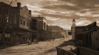
 This image is with the generic sepia applied... Just showing this for contrast purposes

Generic Sepia applied
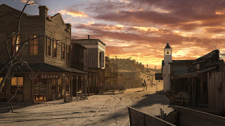
 I did not want to use just plain sepia.  I want color in the image as well.  I want more focus into the depth of the scene, so am bringing the color forward with a z-depth application of the sepia look.
Z-depth Sepia
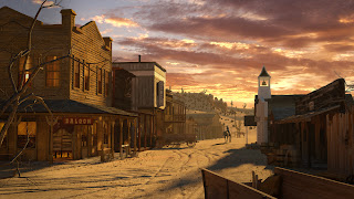
 Same as above with the windows' color brought out more for contrast.
Z-Depth Sepia and Window Adjustment
May work on a bit of scratches and old photo edges.. .not sure.


Wednesday, November 28, 2012

Maya Materials and Effects

Played some with effects today.  I took a break from listening and just messed around some with the materials and fire effect.

I was able to navigate and create a moderately complex shading system and know what I was doing.  Ha!


This is the texture layout for the burning wood.

Below is a still from the fire animation I tinkered around with today.


Maya Dynamics

Starting to learn Maya Dynamics today.   This stuff excites me.  Particles, soft bodies, physics, liquids, etc.

I haven't posted on the western scene for a couple of days because I am waiting for some more feedback on the cgtalk forum.   I will definitely post more tomorrow.

It's week 9 at school and only a month till my sabbatical is over... Panic time?    I feel pretty good about what I have covered and done so far, so not really.

Tuesday, November 27, 2012

Maya Day - Animation

Spent most of my time yesterday working on the gritty stuff for Animation in Maya.  Graph Editor, set keys, set driven, etc.

It was a bit dry because I did not want to skip through it in case I would miss something.

Also spent some time rendering out the western image in high resolution.  Takes about 1.5 hour for that one frame to calculate all the GI and FG and then render!

Wednesday, November 21, 2012

Maya - Dock

some work in Maya
Very basic (and bad) lighting I just threw in so I could see stuff
Boat is incomplete
Nothing is really textured.


Adding Horse to new Camera Angle

Added the horse, tweaked a bit in Photoshop with various adjustment layers.


Tuesday, November 20, 2012

Camera Angle and Lighting

Working on the composition of image some more.

Moved the Wagon around a bit as well as the camera.


Monday, November 19, 2012

Still tweaking...

but am stopping for the day and wanted to post something up.

Worked on some models and materials of the buildings.
Worked on position, lighting, and materials of cowboy and horse.

Threw together very quick comp to see how it is coming along....


Materials & Composition.

Today I am working on modifying the composition of the western scene.  I like the focal point of the cowboy, but he is getting lost in all the textures of the background.  I am considering a couple of things.

  • Manipulating the models' position a bit to get better composition
  • Changing some of the distant materials to be more plain and desaturated.
  • Adjusting the cowboy's texture.
  • Adding the cowboy as a layer instead of rendering as part of scene - enable me to adjust background easier.


Thursday, November 15, 2012

Maya Update

I worked with Maya quite a bit today.  I had short periods (and really long) of time that I was waiting for my Western Scene to test render.... so I opened up Maya.

I just finished going through Lights in Maya and was going to start Animation.  With all the stopping and checking the rendering progress, I decided not to do lessons.  I ended up starting a "simple" scene and working on it.  I will post some rough screen shots tomorrow as all the work is on the laptop.  

Working free hand is a good way to see how well I know it.  For the most part, modeling is pretty smooth.  I may not use all the fancy tools yet, but I am getting done what I need.  Materials - will need some more practice and some work on the Mental Ray materials in Maya... their names are much different than in Max.

My simple scene is a old dock with a boat in the distance.  Images tomorrow possibly.

Working with Global Illumination

Some lighting updates.   worked with Global Illumination and photons.  Lots of rendering and waiting today.

Final Gather Based on HDRI image
Global Illumination only.  10,000,000 photons 

Final Gather and Global Illumination combined.

And as I finished this... I realized I had not unhidden some of the models:  curtains, posters, pebbles, shrubs.  NUTS!   Those Global Illumination calculations take about 3/4 hour to render!

Wednesday, November 14, 2012

No image today

Still working on the lighting.  Who new a sunset would cause so much hassle?  Learning stuff... and that it the whole point anyway.

Continuing with Maya as well.  Have gotten a good over view of materials and shaders as well as lighting.
Nothing to visually post for that.    I have passed all the quizzes and tests though!

Monday, November 12, 2012

Basic Composition Update

Put in the sunset.
No depth of field yet.
Added Ambient Occlusion
Little bit of dust/depth fog.
Little bit of color adjustment
Added a bit of glare around the church top.


Adjusted Lighting

tweaked the lighting some based on some critique.


Thursday, November 8, 2012

New Composition

Some things done recently:
Added the new horse and rider
Added a couple of tumbleweeds
Adjusted the comp so the lit windows are only on the unlit side of the building
Added some Ambient Occlusion - subtle shadows
Added a bit of glare from the sun.
And the usual composition stuff:  Saturation, DOF, Dust layer, etc.


I may also post various locations and direction of the horse and rider later.

Monday, November 5, 2012

Adding the Horse and Rider.


Couple of things on this update
Threw in a quick rider and horse. Very basic texture - just some basic matte with multi-subobject material on character. Very basic pose and horse is not posed at all yet. I need to bring the horse's head to the camera left a bit and down as well as adjusting the legs some. No saddle has been added either. I just wanted to throw this up to see how the focus is looking. I think I may need to actually push the rider and horse back into the scene a bit more.

I don't think I will need much detail in the texture for the sunset shot, but the daylight one, I will need it more. I will also need more work on the modeling for the daylight scene.

I also dropped the light in the saloon another 30%.


Discussion of Style


On my posts at CGtalk.com [Link], there has been some differing opinions on the lighting of the scene and the style of the image.   My post in response follows:

My goal is a stylized realism.... Not sure that makes sense to anyone but me. Maybe 80-90 percent real looking with artistic license for the rest. The lighting of the interior of the saloon... I will probably drop that down a lot more.. right now it's at 66%, I will probably drop it to about 30% or so. I would like to end up with a colored old photo look. Sort of similar to the sepia photos of old, but with some color thrown in.

To me, the image is too saturated for my liking, but I will be fixing that in Pshop in post. I also plan on adding the dust and Depth of Field as in my test image above. I will play around with some glare around the church bell too.